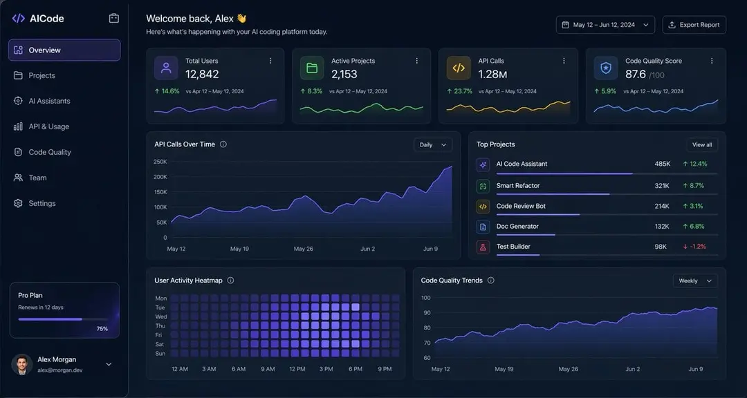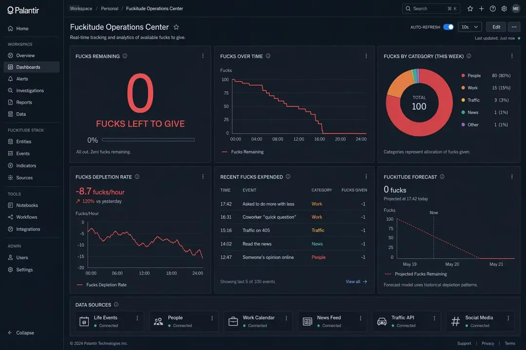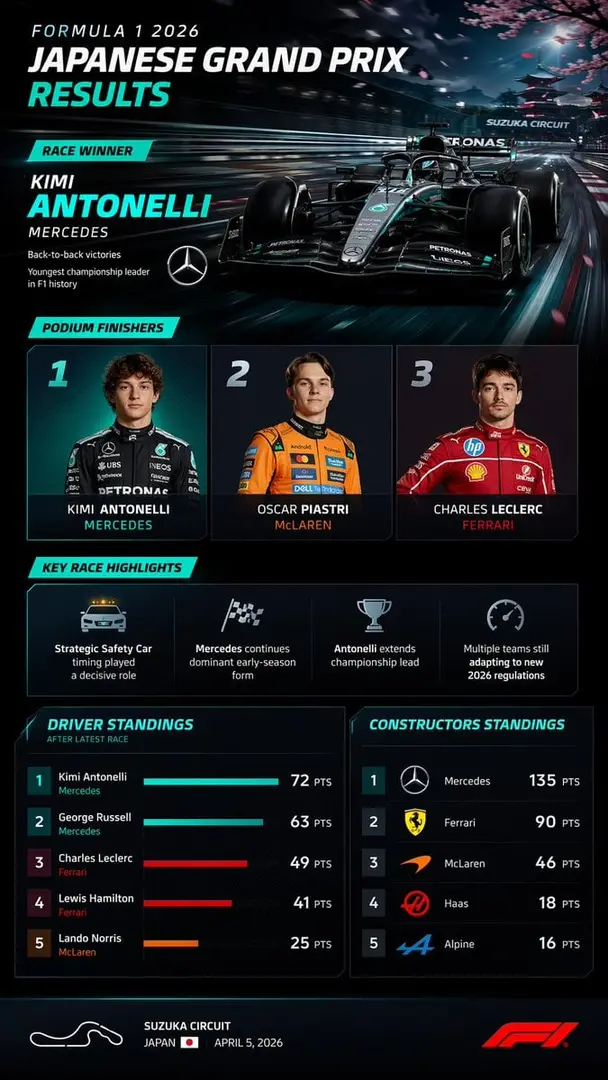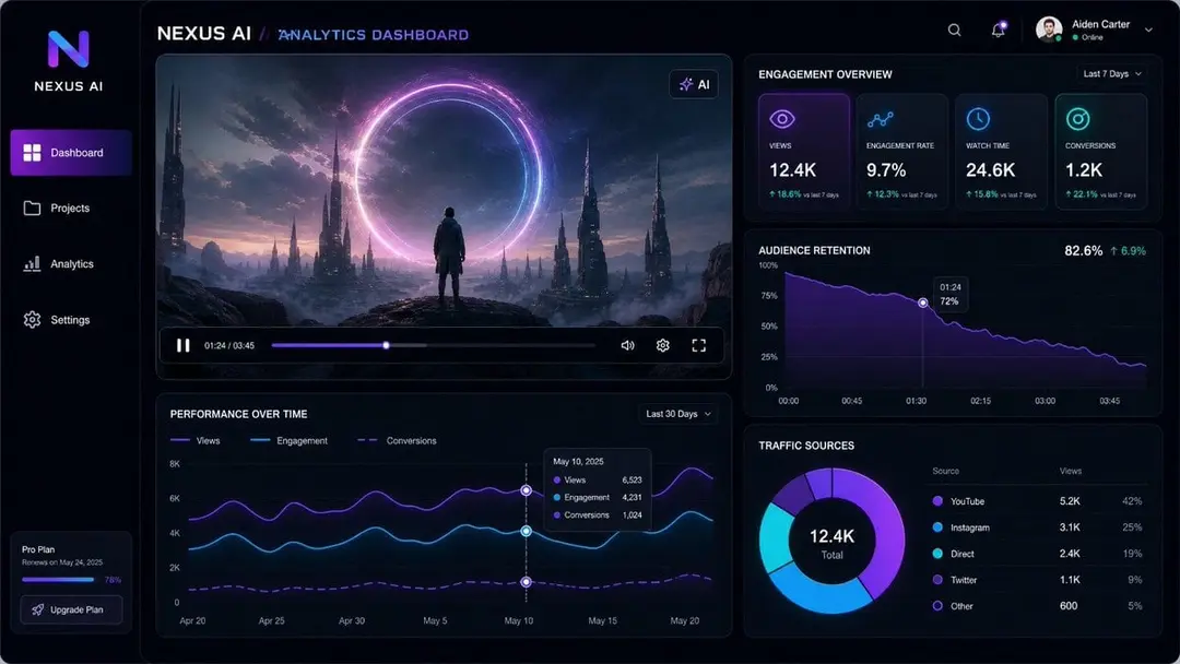
Health dashboard home screen.** Single scrollable mobile screen
Other models image prompt by Mattia · original post
the prompt
"**Health dashboard home screen.** Single scrollable mobile screen.

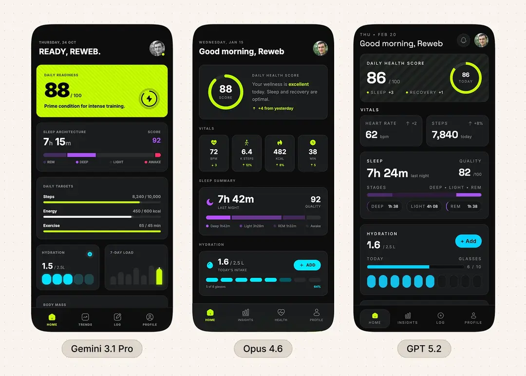
**Structure, top to bottom:** A greeting header with the day/date, the user's name, and an avatar. A daily health score — a single prominent number or ring summarizing today's overall wellness based on sleep, activity, and recovery. A vitals row — three or four key metrics side by side (heart rate, steps, calories burned, active minutes) each with a bold number and a small trend indicator. A sleep summary card showing last night's duration, sleep quality score, and a simplified sleep stage breakdown (deep, light, REM) as a horizontal segmented bar. An activity progress section — three ring-style or bar-style trackers for daily movement goals (steps, active calories, exercise minutes) with current vs. target. A hydration tracker — a simple visual showing glasses or liters logged today against a daily target, with a quick-add action. A weekly trends chart — a 7-day overview of one key metric (steps, sleep, or calories) as a compact visualization with the current day highlighted. A body metrics card — weight, BMI, or body fat with a subtle sparkline showing the trend over the last 30 days. A mindfulness or stress row at the bottom — today's stress level or minutes of meditation logged, kept minimal and low-priority. Bottom navigation with four tabs.

**Style:** Dark, electric, and unapologetically bold. A deep true-black base (#0D0D0D) with no warmth — pure void — that makes every element pop like neon on asphalt. One single accent color owns the entire identity: a sharp electric lime-yellow (#C8FF00) used for CTAs, progress fills, active states, goal completions, and primary action surfaces. It shows up loud and confident — including as full solid fills with a diagonal stripe texture on hero elements, giving them a physical, almost tactile hazard-tape energy. Everything else is strict grayscale: pure white for primary numbers and headlines, mid-gray (#888) for labels and secondary text, and dark charcoal (#1A1C1E) for card surfaces. Cards sit on the dark base with faint 1px borders in rgba(255,255,255,0.08) — no shadows, no gradients, depth comes from brightness alone. Rounded corners at 14-16px, generous padding inside every card. Typography uses a clean geometric sans-serif (Inter or SF Pro) — date and labels are small uppercase and letterspaced in gray, the greeting line is large bold white, and stat numbers are oversized bold with units sitting smaller and lighter beside them. Section headers are always uppercase, letterspaced, small, and white. Progress rings and bars use the lime accent as fill against dark tracks. The lime accent never appears on text — it's always a surface, fill, or indicator. Bottom navigation uses thin-stroked icons in gray with the active tab switching to lime. The app should feel like a biometric cockpit you check first thing in the morning. Think Oura Ring's data depth meets a fighter pilot's HUD meets a hacker terminal that went to design school."
- model
- Other models
- type
- image
- shape
- 4:3
- shared
- February 20, 2026
- prompt
- 481 words
Made this? Fix the credit or remove it.