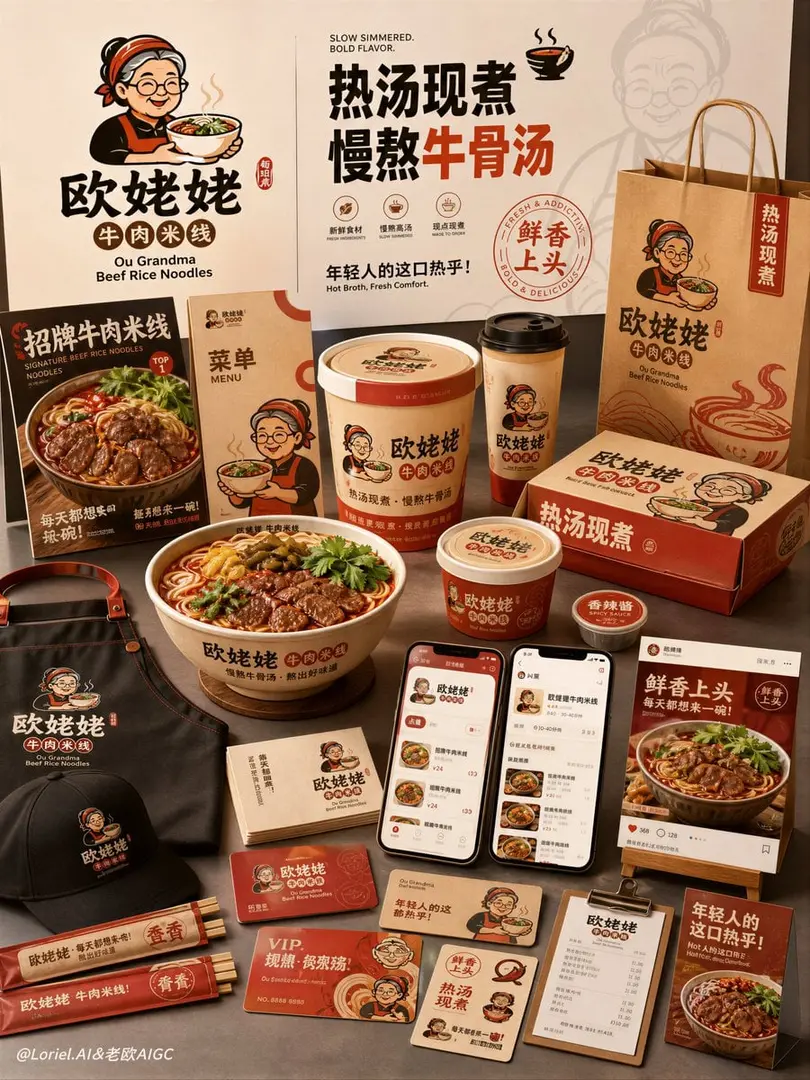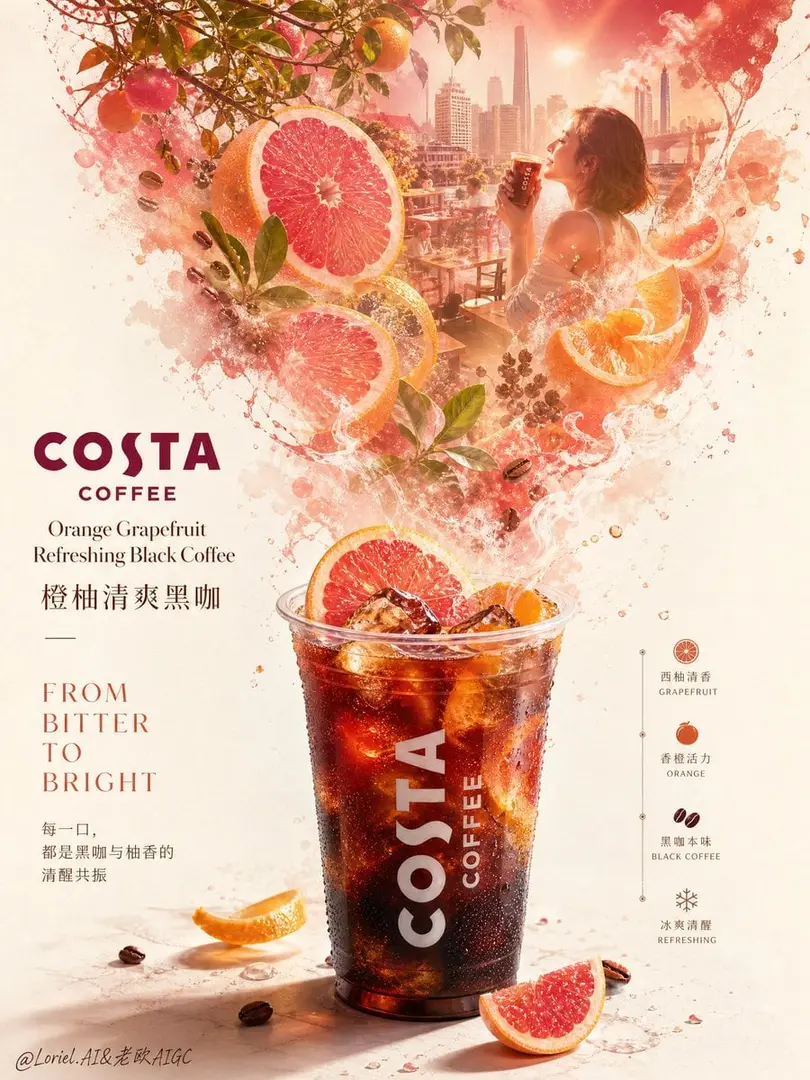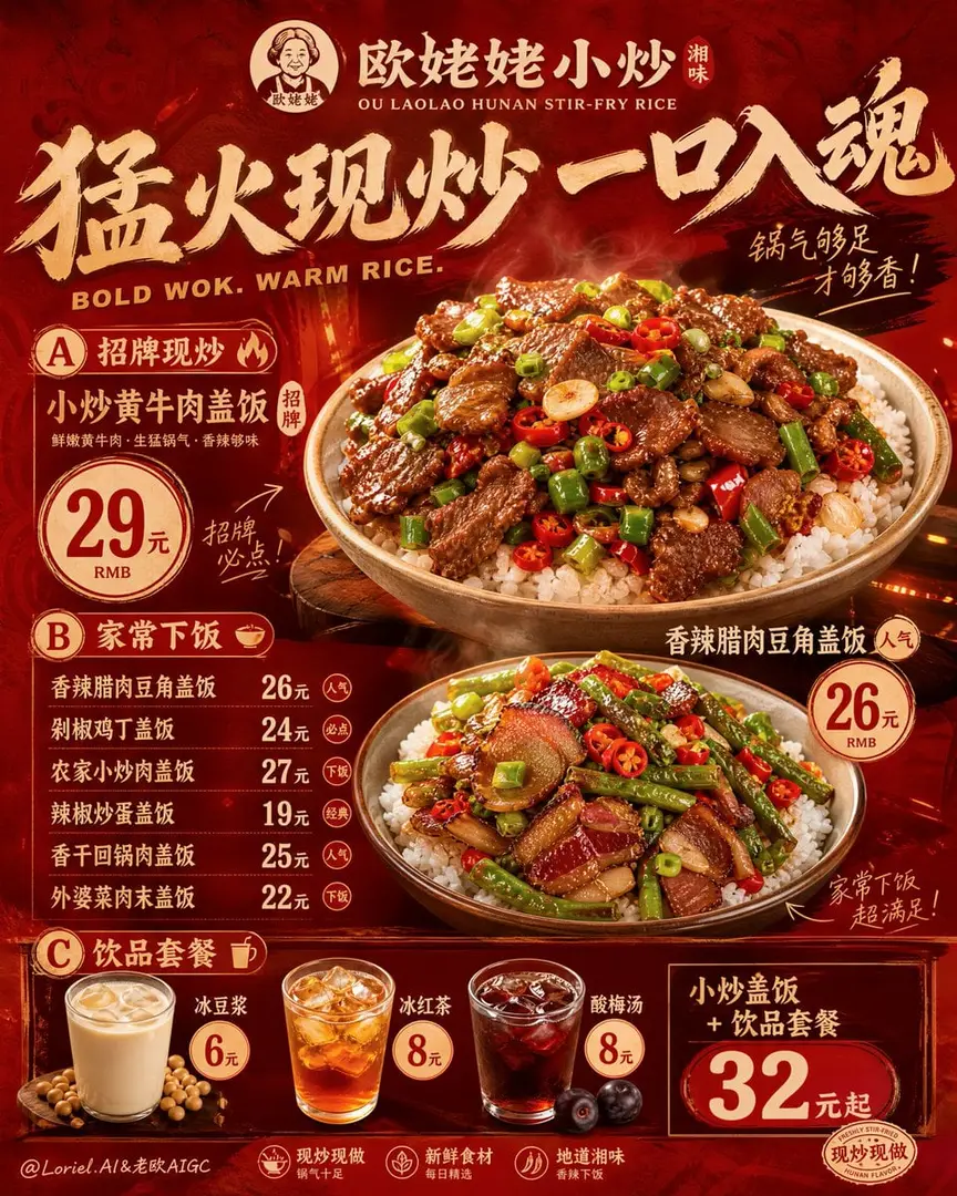
🍔汉堡看起来好不好吃,不是油刷得越亮越好,而是每一层都要有不同的“口感证据”。 ✦ Toasted Bun Texture, Beef Patty Sear
GPT Image 2 image prompt by Loriel.AI · original post
🍔汉堡看起来好不好吃,不是油刷得越亮越好,而是每一层都要有不同的“口感证据”。
the prompt
Create an ultra-premium vertical flagship combo menu poster for a fictional fast-food brand called “欧姥姥汉堡”, preserving the bold stacked commercial logic of a modern burger combo ad while elevating it into a more systemized and more official brand master visual. The final image must feel like a Cannes-level fast-food campaign poster: highly readable, commercially polished, product-dominant, warm, appetizing, and publication-ready.

Core layout:
Use a tall vertical composition with a premium three-part structure:
1. a dark grilled header zone at the top with one giant burger beauty shot and brand title system,
2. four stacked horizontal combo sections beneath, separated by smooth wave-like band transitions,
3. each combo section containing one complete meal set with burger + fries + drink, plus clear title, description, and price hierarchy.
The layout must feel instantly understandable and suitable for a real chain-store menu board.

Brand identity:
Main Chinese title: 欧姥姥汉堡
English subtitle: OU LAOLAO BURGER
Add a minimal official logo mark or seal-like icon in the top area. Use Chinese as the dominant language, supported by a refined smaller English subtitle. Typography must feel clean, bold, premium, and modern-commercial. Unify the logo, price badges, promotional marks, English subtitle, and all small graphic accents into one coherent brand language.

Transit emphasis:
Organize the four combo sections into a clear product-line system:
A. 经典牛肉
B. 浓芝双层
C. 清爽鸡腿
D. 重磅培根
Each section must have consistent title rhythm, aligned description blocks, unified price layout, and matching internal spacing. The poster should feel like a mature menu architecture rather than four disconnected ads.

Port emphasis:
Elevate the entire poster into an official flagship brand visual. Tighten the style consistency of the header, logo, section labels, recommendation marks, price tags, and subtitle typography. Every wave band, badge, and text block must feel curated, cohesive, and store-ready. The final image should read like an official launch poster for a real burger chain.

Top header:
Create a dramatic dark grilled header with one close-up giant burger beauty shot in the background or upper area: glossy brioche bun, juicy beef patty, melted cheese, lettuce, tomato, onion, and sauce sheen with subtle grill warmth. Overlay the brand title elegantly in this zone. The header must feel rich, deep, and premium, while leaving the burger readable.

Combo product lines:

经典牛肉
- 招牌厚牛堡套餐 29元
Include: thick beef burger + golden fries + iced cola
Description: 布里欧修面包、厚切牛肉饼、生菜、番茄、洋葱、招牌酱

浓芝双层
- 浓芝双层堡套餐 32元
Include: double beef cheeseburger + fries + iced cola
Description: 双层牛肉饼、双层芝士、酸黄瓜、洋葱、浓香汉堡酱

清爽鸡腿
- 清爽鸡腿堡套餐 26元
Include: crispy chicken burger + fries + lemon iced tea
Description: 香脆鸡腿排、生菜、黄瓜片、清爽风味酱

重磅培根
- 火烤培根双拼堡套餐 36元
Include: beef and bacon double burger + fries + cola
Description: 火烤牛肉饼、烟熏培根、融化芝士、番茄、洋葱、汉堡酱

Food realism:
Push extreme realism in every visible food element:
- glossy bun surface,
- toasted bun texture,
- beef patty sear marks,
- melted cheese stretch and edge softness,
- lettuce hydration,
- tomato translucency,
- onion crispness,
- bacon char shine,
- sauce gloss,
- fry salt crystals,
- drink ice condensation,
- cup reflections,
- crumb textures,
- subtle heat cues.
Everything must feel freshly assembled, premium, and deeply edible.

Combo presentation:
Each section should clearly show one burger, one fries serving, and one drink. The burger must dominate the trio composition, fries should spill naturally, and the drink should catch premium highlights and condensation. The four sections must feel related but distinct.

Typography and pricing:
Use strong Chinese combo names as the main titles, with elegant smaller English support only where helpful. Each combo section should include:
- one combo title,
- one concise Chinese ingredient description,
- one consistent price badge system.
Use a unified price architecture, such as:
- 单点
- 套餐
or just one combo price if visually cleaner, but keep the logic consistent across all four sections.

Color system:
Use a premium fast-food palette:
- dark grilled brown header,
- warm cream band,
- vivid orange-red band,
- deep brown band,
- light beige or cream band.
Each section should be visually distinct while remaining harmonized. The burgers must remain the brightest appetite focal points.

Lighting and contrast:
Use high-end commercial food lighting with warm highlights and clean contrast. Strengthen the dimensionality of buns, patties, fries, and cups. The food should glow against the flatter poster bands, while shadows stay rich and controlled. Avoid muddy blacks or overexposed cheese.

Art direction:
The final poster must feel like a modern flagship burger-combo campaign: simple, bold, highly marketable, and immediately orderable. No app interface, no random diner clutter, no excessive props. The food, product-line system, and typography must work together like an official brand menu mother-board.

Rendering style:
ultra-realistic burger combo flagship poster, official menu board for 欧姥姥汉堡, dark grilled header, four stacked wave-banded combo sections, Chinese-first premium typography, unified brand logo and price-badge system, giant burger beauty shot, realistic burger fries cola meal sets, glossy bun texture, melted cheese, seared beef, crispy fries, iced drink condensation, mature fast-food chain branding, Cannes-level advertising art direction, 8k

Negative prompt:
smartphone UI, app interface, cheap flyer layout, low-detail burger, fake plastic cheese, dull fries, flat cola, unreadable typography, crude fonts, cluttered composition, weak combo hierarchy, greasy blur, random diner props, muddy lighting, excessive black patches
- model
- GPT Image 2
- type
- image
- shape
- 4:5
- shared
- August 7, 2026
- prompt
- 857 words
Made this? Fix the credit or remove it.