系列海报最怕每一格都在讲新故事,最后记不住品牌。 🟡 Repeat The Same Yellow Cup And
GPT Image 2 image prompt by Loriel.AI · original post
系列海报最怕每一格都在讲新故事,最后记不住品牌。
the prompt
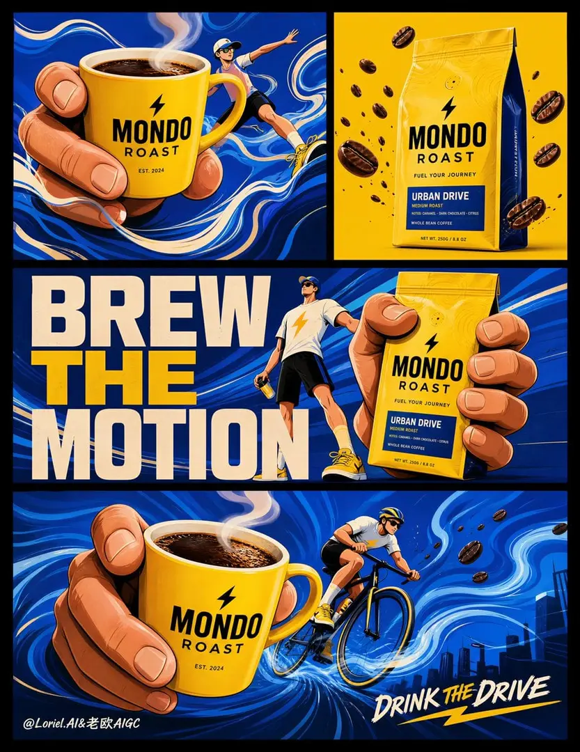
Create an ultra-premium campaign board for an original coffee brand called MONDO ROAST, designed as a Cannes-level graphic advertising system that preserves the exact modular structure, color impact, and playful commercial rhythm of the image, while integrating stronger first-glance brand punch, a tighter visual system, and a more iconic sense of coffee-driven energy transmission. The final artwork is a tall vertical campaign board set against a black outer field, containing a precise 4-panel poster composition: two smaller panels on the top row, one wide typographic-product panel in the middle, and one large hero illustration panel at the bottom. The whole board must feel like one unified international advertising campaign, not separate posters.

Core campaign structure:
Keep the exact multi-panel board logic. The top-left panel features a giant hand presenting a bright yellow coffee cup inside a blue motion field. The top-right panel features the MONDO ROAST coffee bag isolated on a bold yellow field with coffee beans in controlled movement. The middle panel features one giant hand gripping the coffee bag, one sporty miniature character, and a huge bold campaign statement. The bottom large panel features a giant hand extending the yellow coffee cup toward the viewer while a cyclist moves through a powerful blue energy field. The composition must immediately communicate brand, coffee, motion, and vitality within the first second of viewing.

Brand and product dominance:
The MONDO ROAST coffee bag and yellow coffee cup must hit harder visually and read faster than before. Increase their perceptual scale and graphic importance across the whole board. The cup and bag must become the unmistakable brand memory anchors, with the giant hand gestures functioning as delivery devices of energy and identity. The yellow cup should feel iconic, like a branded urban object with immediate recognition. The bag must feel equally strong, with bold front-facing logo visibility, sharper packaging silhouette, and more commanding placement.

Transit system enhancement:
Unify every panel into a stricter international graphic-advertising system. The human proportions, hand shapes, blue wave textures, coffee bean trajectories, typography weight, shoe design, bicycle geometry, outline thickness, and negative-space balance must all belong to one coherent art direction family. The blue energy backgrounds should share the same swirling motion grammar. The yellow brand objects must use the same tonal family across cup, bag, and accent graphics. The whole system should feel curated, mature, and collectible, like a flagship campaign launch.

Port concept enhancement:
Push the lower hero scene and the entire board toward a stronger symbolic idea: coffee as a visible engine of urban motion. The blue wave fields must feel less like decorative abstract backgrounds and more like energized currents generated by aroma, momentum, and caffeine flow. In the bottom panel, the cyclist should appear to move through a living current of coffee-powered velocity, with the extended cup acting as the origin point of that energy transmission. In the middle and upper panels, the giant hands should feel less merely illustrative and more like brand emissaries passing power forward. The campaign should feel like MONDO ROAST is not just being consumed, but actively injected into movement, rhythm, and everyday performance.

Visual language:
Use a premium flat-graphic illustration style with strong shape design, long-limbed sporty characters, oversized expressive hands, smooth curves, crisp outlines, poster-like negative space, and flowing blue fields. The illustration must feel witty, modernist, energetic, and international. The style should remain clean and bold, never childish, while preserving the charming exaggeration of scale and gesture.

Panel-specific logic:
Top-left panel: a giant hand holding the yellow MONDO ROAST cup, with a sporty miniature figure integrated into the gesture, surrounded by stronger flowing blue currents that suggest warmth and motion transfer.
Top-right panel: the MONDO ROAST bag on a saturated golden-yellow background, with coffee beans flying in a tighter, more directional rhythm that points inward toward the logo.
Middle panel: a huge graphic campaign statement such as “BREW THE MOTION” or “PASS THE ENERGY,” combined with a giant hand gripping the coffee bag and one sporty character in an assertive stance, making the brand feel like the center of action.
Bottom panel: the most iconic hero image, with a giant hand pushing the yellow cup toward the viewer and a cyclist riding through a dense blue current that feels generated by coffee aroma, speed, and urban pulse.

Typography:
All text must be fully original and in English only. Use bold oversized campaign typography with strong editorial poster presence. The middle-panel slogan must be large, immediate, and brand-defining. Add a smaller branded line or hashtag in the bottom panel, such as “DRINK THE DRIVE” or “MOTION STARTS HERE.” Typography must feel custom, energetic, tightly art-directed, and perfectly integrated into the layout.

Color system:
Use a disciplined, high-impact palette of cobalt blue, saturated golden yellow, warm cream, coral-pink skin tones, crisp white, and small red-orange accents. The blue-yellow contrast must remain the dominant visual identity. Black stays mostly in the outer board frame and selected grounding details. Every panel must feel clearly related through this consistent palette.

Product realism and material cues:
Although the world is stylized, the coffee bag and yellow ceramic cup must feel more materially convincing and commercially desirable than the illustration around them. The cup should have smooth ceramic gloss, hot coffee surface depth, and subtle steam cues where appropriate. The bag should show believable folds, printed branding clarity, and tactile packaging structure. Coffee beans should feel roasted, dense, and appetizing.

Lighting and energy feel:
Keep the lighting crisp and poster-clean. The product objects must have the clearest highlights and strongest clarity. The blue motion fields should feel electrically fluid yet warm, as if coffee aroma and human energy have merged into one visual force. The whole campaign must feel bright, rhythmic, optimistic, and powerful.

Creative direction:
The final campaign board must feel like a world-class coffee advertising system where giant gestures, sporty life, and graphic motion all revolve around one unmistakable brand. The strongest first impression must be brand impact and energy transmission: MONDO ROAST is the object being offered, the spark being passed, and the force driving the whole urban rhythm.

Mood:
energetic, playful, optimistic, graphic, urban, rhythmic, bold, iconic, sporty, warm, brand-driven, high-impact, collectible

Rendering style:
ultra-premium campaign board, 4-panel modular coffee advertising system, bold flat illustration, giant hands, sporty miniature characters, stronger product dominance, coffee-powered energy transmission, cobalt blue and golden yellow modernist palette, hyper-real coffee bag and iconic yellow cup, editorial typography, 8k, world-class commercial graphic design

Negative prompt:
copied existing coffee branding, copied slogans, messy layout, weak product visibility, childish cartoon style, muddy blue tones, generic packaging, flat unappealing coffee cup, cluttered typography, low-resolution poster board, inconsistent panel system, weak brand recall
- model
- GPT Image 2
- type
- image
- shape
- 3:4
- shared
- August 11, 2026
- prompt
- 1,106 words
Made this? Fix the credit or remove it.