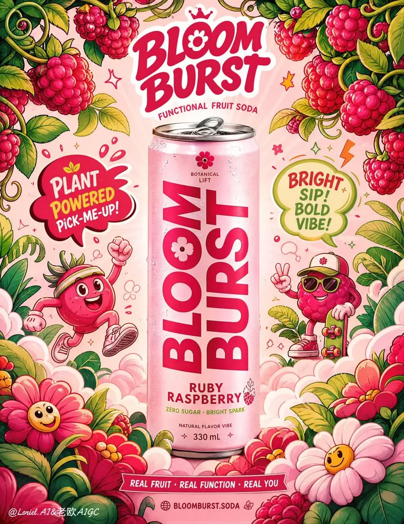
🧃想把饮料海报做得热闹又不乱,关键不是少画角色,而是让所有角色都在“给罐子让路”。 ✦ One Enlarged Centered Slim Can; Lemo
GPT Image 2 image prompt by Loriel.AI · original post
🧃想把饮料海报做得热闹又不乱,关键不是少画角色,而是让所有角色都在“给罐子让路”。
the prompt
Create an ultra-premium advertising poster for a fictional functional soda brand called “BLOOM BURST”, designed as a collectible pop-surreal packaging campaign with stronger product focus and tighter illustrative framing. The final artwork must combine one hyper-realistic slim can as the absolute hero with a surrounding world of playful hand-drawn illustration, vibrant fruit storytelling, soft premium lighting, and a highly controlled graphic composition. The image should feel like a Cannes-level commercial poster: bold, youthful, fun, and visually rich, while keeping the can as the clear center of gravity.

Core composition:
Use a tall vertical poster with one centered slim soda can standing upright in the middle of the frame. Enlarge the can slightly so it occupies more of the composition and reads more powerfully from a distance. Around the can, build a dense but highly organized illustrated universe in which the top raspberry vines curve inward more tightly and the bottom flowers rise upward more clearly, creating a stronger enclosing frame around the can. The surrounding illustrated world should feel as if it is wrapping the product in a lively fruit-energy halo while still leaving the can fully visible and dominant.

Brand creation:
Create a fictional soda brand:
Brand name: “BLOOM BURST”
Product line: “FUNCTIONAL FRUIT SODA”
Flavor name: “RUBY RASPBERRY”
Support line: “Zero Sugar · Bright Spark”
Optional micro copy:
“Botanical Lift”
“Natural Flavor Vibe”
“330 mL”
All text must be original, premium, playful, and beautifully art-directed. Do not copy any wording from the sample. Typography should feel custom, bold, youthful, and full of brand personality.

Product realism:
Render the can with extreme photorealistic precision. Use a slim aluminum can with a soft pink body, bold oversized vertical typography, crisp flavor naming near the base, realistic pull-tab detail, subtle metallic reflection, fine print clarity, believable cylindrical curvature, and a premium matte-gloss balance. Add very light condensation hints and a soft grounding shadow. The can must feel tactile, shelf-ready, and globally marketable. Because the can is slightly enlarged, the typography and print fidelity must feel even sharper and more confident.

Illustration world:
Surround the can with a whimsical illustrated universe in a contemporary pop-doodle style. Include:
- raspberry vines and clustered berries near the top corners, now bending inward more toward the center
- stylized tropical leaves and rounded foliage forms framing the mid-sides
- smiling flowers and bubbly cloud puffs near the bottom foreground, rising upward to cradle the can more tightly
- one or two quirky mascot characters with sporty or carefree energy
- speech-bubble shapes and splash bursts
- floating dots, spark shapes, and playful outline motifs
The illustration must feel highly designed, energetic, and collectible, not childish-chaotic. The linework should be clean, confident, and consistent.

Transit-style system discipline:
Keep the entire poster standardized under one mature visual system. The can design, mascot illustration, speech bubbles, leaves, berries, flowers, splash shapes, and decorative outlines must all follow one consistent line-thickness family, color logic, and spacing rhythm. The surrounding illustrated elements should feel systemized, not randomly scattered, even though they are lively and abundant.

Port-style elevation:
Without changing the centered-can concept and playful illustrated universe, elevate the poster into a more collectible official campaign image by editing the surrounding elements into a more valuable arrangement. Let the top vines and bottom flowers function almost like a deliberate ornamental frame, giving the composition a stronger poster silhouette. Reduce any unnecessary micro doodles and keep only the most expressive shapes, so the image feels richer but also more curated and premium.

Typography layout:
Place the brand logo near the upper center. Add one strong graphic callout bubble on one side and one secondary flavor-energy phrase on the other side, both in playful custom lettering. Keep all text carefully composed around the can, with the can always remaining dominant. Include a minimal footer area with one social-style brand line or website-style support text if needed, but keep it elegant and sparse.

Color direction:
Use a premium pop palette centered on blush pink, raspberry magenta, creamy white, cherry red, lime-green accents, and soft coral-orange details. The colors should feel joyful and bold in personality, but still polished and commercially refined. Avoid muddy tones or cheap neon overload.

Lighting:
Use soft refined studio lighting with smooth transitions and no harsh glare. The can should receive gentle frontal light with a soft top highlight, while the illustrated world remains flat-graphic but subtly integrated with soft ambient shadow and spatial layering. The final poster must feel bright, premium, and dimensional without losing the graphic punch.

Graphic discipline:
Even though the poster is playful and full of illustrated elements, maintain strong brand hierarchy, clean spacing, and premium poster structure. The can must stay unmistakably central. The top and bottom framing elements should now work more intentionally to intensify product focus and create stronger first-glance containment.

Mood and quality:
premium functional soda campaign, enlarged hyper-real slim can, tightly framed pop-surreal fruit world, collectible packaging poster, bold playful typography, raspberry flavor energy, youth-culture branding, polished commercial illustration, strong central product dominance, 8k, world-class advertising image quality

Negative prompt:
cheap cartoon style, cluttered composition, weak can visibility, unreadable packaging text, generic font, low-detail can, messy doodles, muddy colors, oversaturated neon chaos, harsh reflections, hard shadows, low resolution, random unrelated props, weak framing structure
- model
- GPT Image 2
- type
- image
- shape
- 3:4
- shared
- August 9, 2026
- prompt
- 873 words
Made this? Fix the credit or remove it.