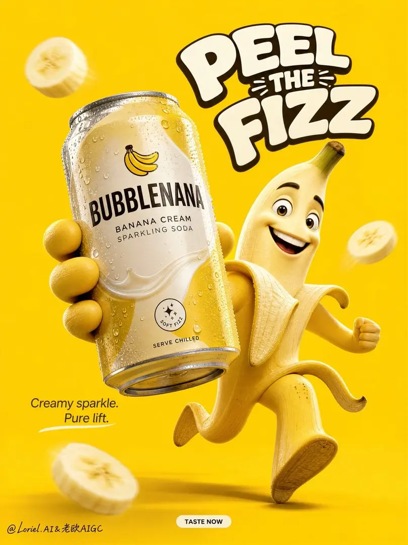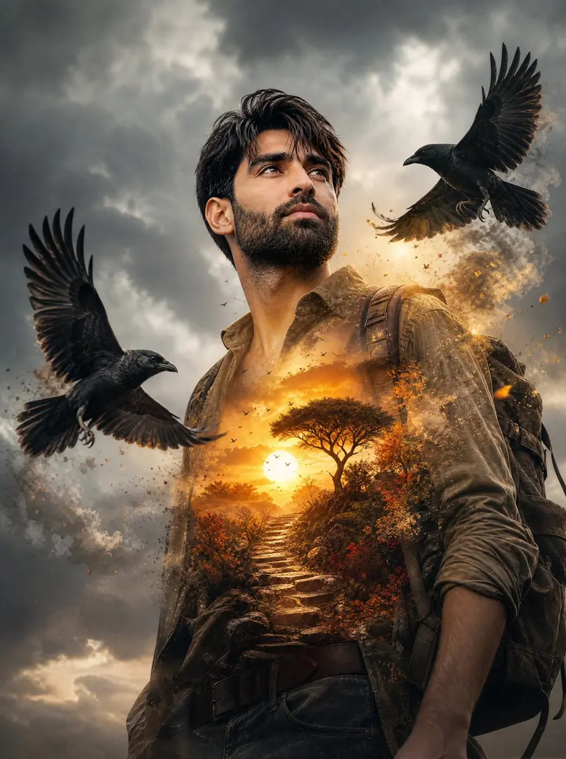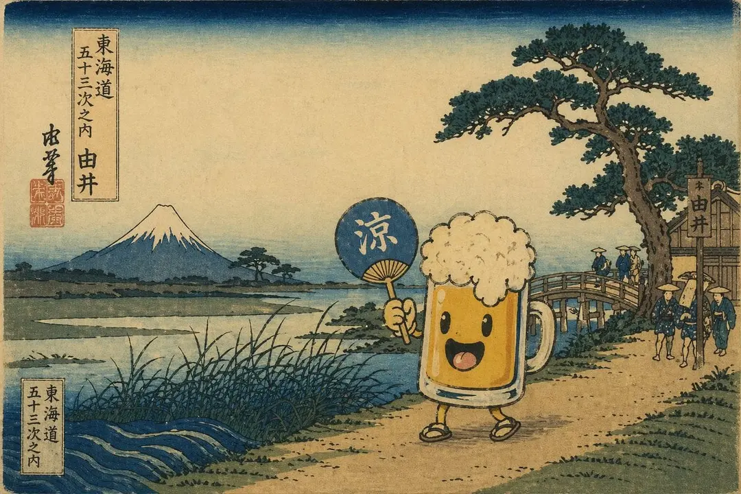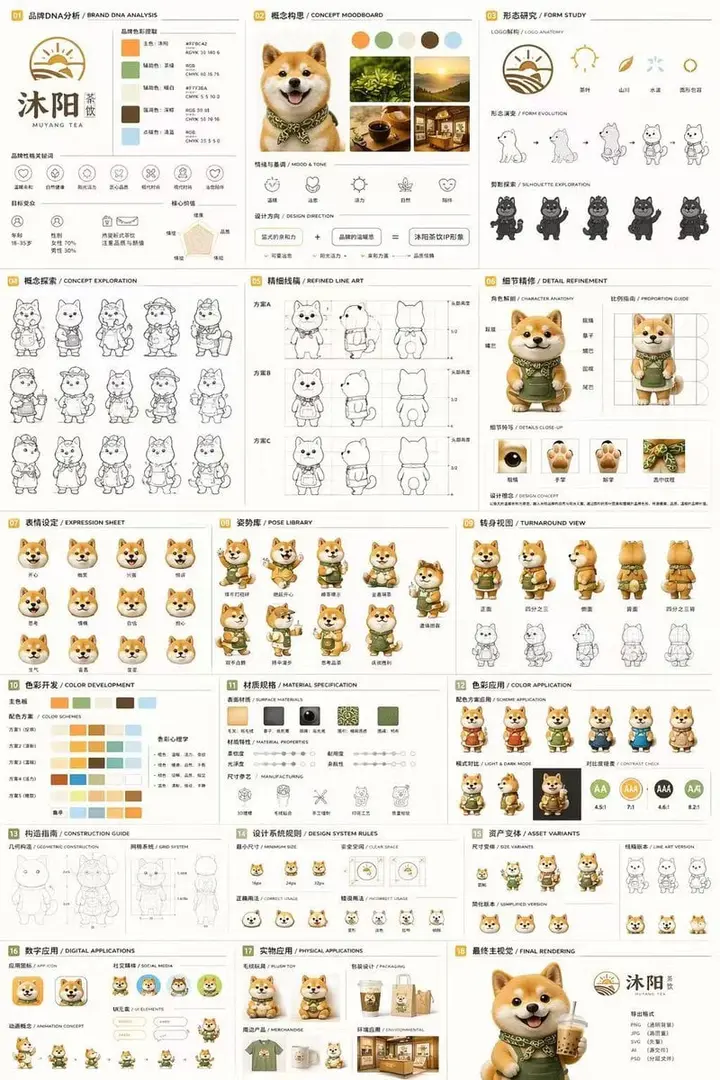
Ip不是拿着产品就算代言;它得像是被产品驱动的。 🦊 Can Locked On The Mascot’S Chest-To-Hand
GPT Image 2 image prompt by Loriel.AI · original post
IP不是拿着产品就算代言;它得像是被产品驱动的。
the prompt
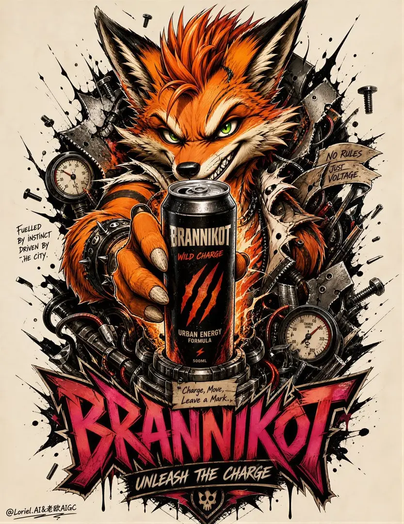
Create an ultra-premium street poster advertisement for an original urban energy drink brand called BRANNIKOT, designed as a Cannes-level hybrid between collectible mascot branding, tattoo-flash illustration, and real product advertising, with a tighter unified street-ink system and a stronger totemic fusion between the fox mascot and the energy-drink can. Preserve the exact core structure and visual logic of the image: one tall vertical poster on a pale neutral background, one giant feral cartoon-fox mascot dominating the center, an aggressive black explosion of splatter and metal fragments behind it, and a bold stacked custom wordmark occupying the lower section. The final image must feel like one complete brand totem, where the product is not only held by the mascot but functions as the power core of the entire visual organism.

Core composition:
Use a strict tall vertical layout with a pale off-white or concrete-gray background and one central towering mascot composition. The main figure is an exaggerated punk fox character leaning forward toward the viewer with a mischievous grin, oversized expressive green eyes, sharp ears, spiky burnt-orange hair, and one arm thrust forward in strong perspective. Behind the mascot, build a dense but controlled vertical explosion of black ink splatters, torn metal plates, bolts, pressure gauges, ribbons, screws, and mechanical debris, all arranged as one tight emblematic silhouette. The whole poster must read like a single street icon rather than scattered decorative parts.

Hero product:
Integrate one hyper-real premium energy drink can as the absolute commercial anchor, locked directly into the fox mascot’s chest-to-hand axis so it feels structurally central to the composition. The can may be gripped in the forward hand, but it must also read as the energetic heart of the entire poster. Design the can for BRANNIKOT with a matte-black base, searing orange-red graphic zones, sharp cream typography, and a claw-mark emblem. Add original English product naming such as:
BRANNIKOT
WILD CHARGE
URBAN ENERGY FORMULA
The can must look cold, tactile, collectible, and globally market-ready, with subtle condensation, metallic highlights, precise pull-tab detail, and strong shelf impact.

Transit visual system:
Unify every element into one mature street tattoo graphic language. The black splatter, metal scraps, bottom wordmark, handwritten side notes, gauge markings, ribbon fragments, and green eye highlights must all follow one disciplined visual system: consistent contour weight, controlled roughness, coordinated edge treatment, balanced negative space, and a clear hierarchy between black structure, orange fur, cream accents, and magenta brand typography. The whole image must feel like an official international street-culture campaign, not a collage of separate motifs.

Port totem reconstruction:
Push the mascot and product into a stronger symbiotic brand-totem relationship. The can should feel like the fox’s visible core reactor or urban power heart, with surrounding gauges, bolts, fractured panels, and ribbon elements appearing to grow outward from the can area. Let the fox anatomy, especially chest, forearm, and hand gesture, subtly organize itself around the can so the viewer feels the mascot is powered from within by the product. The surrounding mechanical fragments should not feel random; they should read like ritualized brand organs orbiting a central energy source.

Mascot design:
Create the fox as an iconic original brand creature, not cute and not childish. It should feel feral, witty, cocky, and electric, like a street-born trickster symbol of motion and charge. Use vivid orange fur with creamy underfur, dark outline control, subtle fur texture, bold cheek structure, sharp grin, strong brow shape, and intense green eyes. Add punk-tattoo styling cues such as wristband hardware, torn cuff detail, stripe-like fur accents, and slight industrial aggression without turning into sci-fi fantasy. The mascot must feel like the permanent face of the brand.

Illustration style:
Render the mascot and surrounding world in an ultra-premium graffiti-tattoo poster style: thick black contour lines, vivid cel-shaded form, airbrush-style tonal blending, sticker-like edge pop, hand-inked splatter, comic-punk force, metallic scraps, gauge detailing, torn paper ribbons, and ornamental urban chaos. The style must feel polished, collectible, and deliberately designed, like a high-end skate graphic or luxury streetwear artwork.

Typography and layout:
Create a fully original custom English wordmark stack in the lower section with layered tattoo-graffiti energy. Use:
BRANNIKOT
as the main brand wordmark, rendered in angular hand-built lettering with dark outlines and hot magenta-to-burgundy depth accents. Add a smaller sharp support line such as:
UNLEASH THE CHARGE
or
BORN TO SPARK MOTION
Add one small handwritten annotation-style English detail in the mid-lower area, but keep all wording original and art-directed. Typography must feel fused into the totem, not pasted on afterward.

Product-world integration:
Make the can feel like the energy source of the entire poster. Let selected black splatter, bolts, gauge needles, ribbon ends, and fracture marks visually radiate from the can into the mascot’s chest, forearm, grin line, and lower typography stack. Preserve clarity: the can remains the cleanest and most realistic object, while the surrounding graphic world behaves like an energized extension of it.

Lighting:
Use premium studio-commercial lighting on the can and subtle dimensional lighting on the mascot. The product should receive the crispest highlights, clean material separation, metallic edge definition, and realistic reflections. The illustrated fox should retain strong volume with polished shading, while the background chaos remains slightly flatter and more graphic. The contrast between real product lighting and graphic mascot energy is essential.

Color direction:
Use a disciplined palette of burnt orange, hot rust, cream, black, charcoal, muted steel gray, acid-green eye accents, and bold magenta lettering near the bottom. Keep the image high-contrast, street-aggressive, and collectible, with the can harmonized tightly to the mascot and typography.

Creative direction:
The final poster must feel like a world-class street-brand advertisement where mascot identity, product desirability, and symbolic brand structure merge into one unforgettable emblem. It should carry the impact of a luxury skate-culture campaign, the memorability of a global energy-drink mascot, and the graphic precision of a premium tattoo poster. The product must remain commercially dominant, while the fox becomes the emotional and cultural vessel of the brand.

Mood:
rebellious, feral, witty, high-voltage, collectible, street-born, punk-luxury, aggressive, energetic, iconic, youth-driven, graphic, explosive

Rendering style:
ultra-premium mascot advertising poster, hyper-real energy drink can, central punk fox brand creature, unified graffiti-tattoo illustration system, product-as-power-core totem composition, black splatter and metal debris emblem, custom stacked street typography, 8k, world-class campaign image quality

Negative prompt:
copied existing mascots, copied slogans, cheap tattoo flash, weak can visibility, childish cartoon fox, generic energy drink design, cluttered unreadable composition, muddy colors, plastic-looking can, low-resolution splatter, messy typography, low-end streetwear poster
- model
- GPT Image 2
- type
- image
- shape
- 3:4
- shared
- August 11, 2026
- prompt
- 1,077 words
Made this? Fix the credit or remove it.