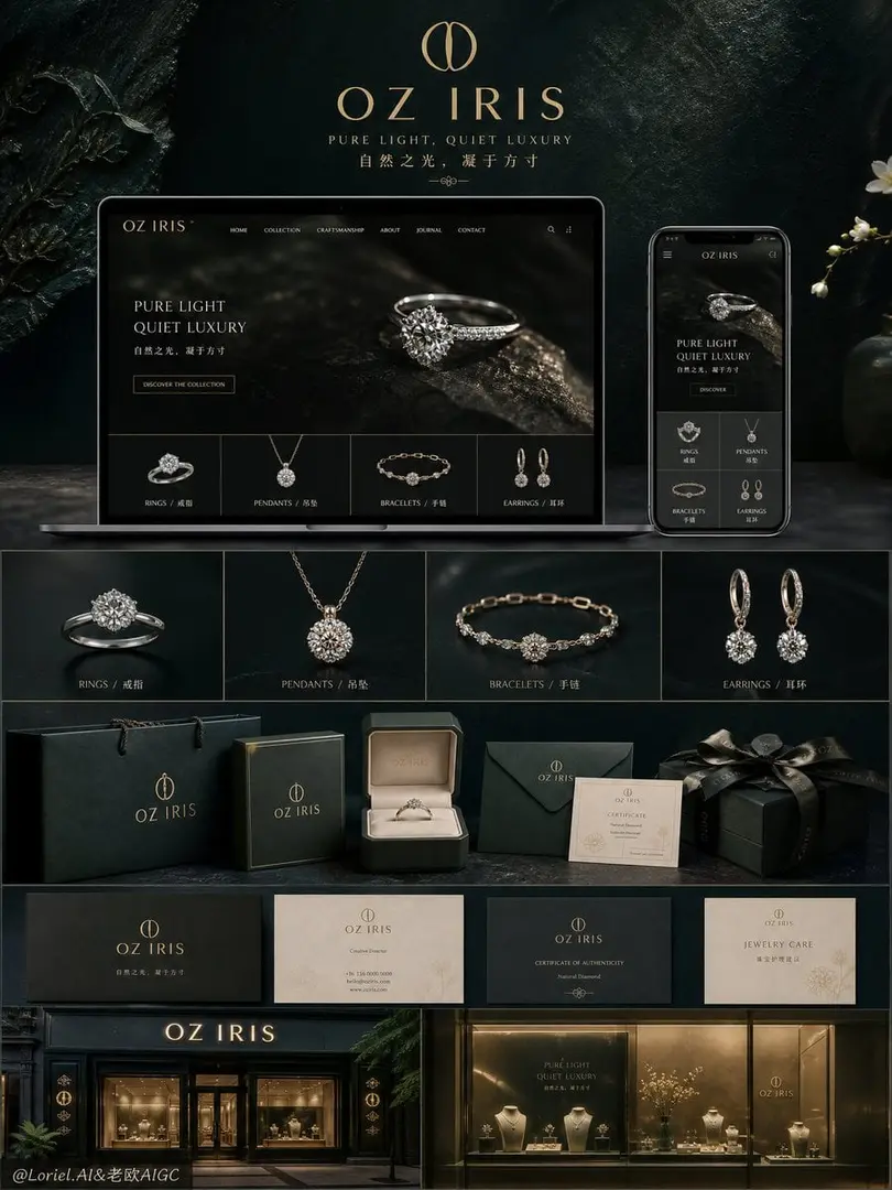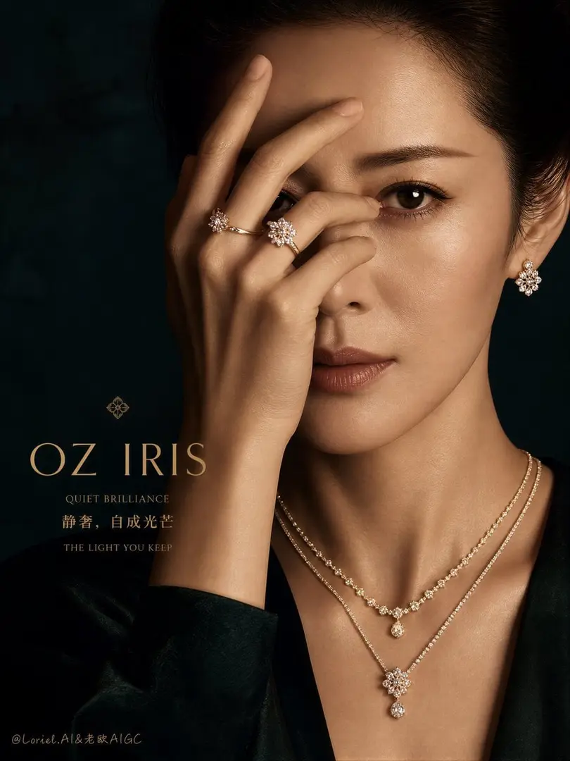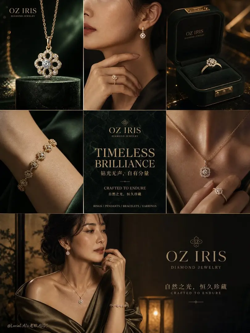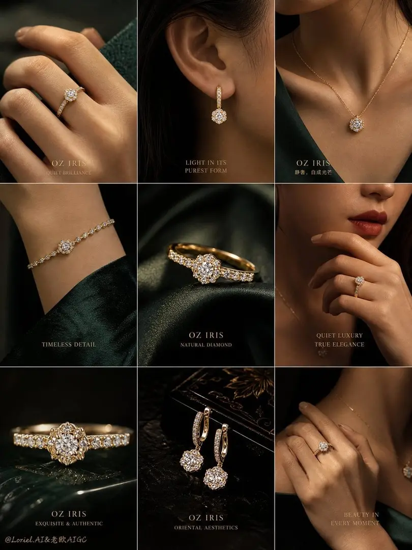
化妆品 品牌视觉提案图 4 Cosmetics Brand Visual Concept Image
GPT Image 2 image prompt by Loriel.AI · original post
化妆品 品牌视觉提案图 4 Cosmetics Brand Visual Concept Image 4 GPT- image 2 prompt👇 Create a premium 2x3 brand showcase collage for SHISEIDO ULTIMUNE, vertical 4:5 composition, designed as a luxury skincare so
the prompt
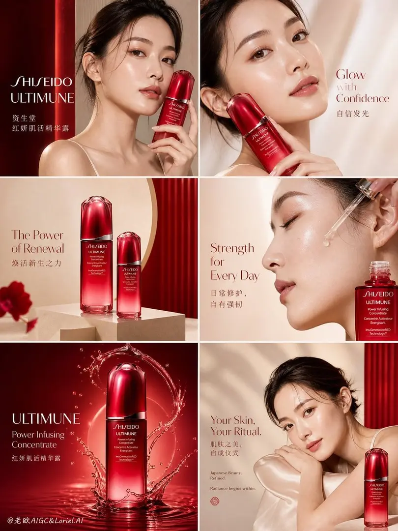
Create a premium 2x3 brand showcase collage for SHISEIDO ULTIMUNE, vertical 4:5 composition, designed as a luxury skincare social campaign matrix focused specifically on the SHISEIDO Ultimune hero line. The final image should feel like a refined global beauty campaign rollout built around one iconic product family, with strong red-series identity, clean Japanese luxury aesthetics, and highly cohesive editorial storytelling.

OVERALL DIRECTION:
A six-panel premium beauty collage, unified around SHISEIDO ULTIMUNE Power Infusing Concentrate as the dominant hero product. The full layout should feel like a polished campaign content system for the Ultimune red line: luminous skin, restorative power, confidence, ritual, and iconic Japanese beauty branding. It should look like a real SHISEIDO red-series campaign, not a generic skincare board.

LAYOUT:
Use exactly 6 panels in a clean 2x3 grid with narrow spacing and perfect alignment.
Every panel should visually connect back to the same hero product and the same color world.
Do not turn it into a full skincare lineup board. Keep the focus concentrated on the Ultimune red line and a small number of closely related product views.

BRAND:
SHISEIDO
Chinese support:
资生堂

HERO PRODUCT:
SHISEIDO ULTIMUNE Power Infusing Concentrate
Chinese product line:
红妍肌活精华露

The bottle must remain the dominant recurring product in multiple panels:
deep translucent lacquer-red bottle,
rounded sculptural cap,
clean white logo print,
premium reflective glass,
slight dew or condensation,
soft inner glow,
luxury product realism.
It should feel iconic and unmistakable across the whole collage.

MODEL:
A mature Japanese-Korean Asian woman in her late 20s with natural refined facial features, luminous realistic skin texture, soft glossy makeup, healthy elegant proportions, and calm premium beauty presence. No influencer face, no over-retouching. Hair should be softly tied back or naturally neat. Styling should remain minimal: ivory strap top, soft silk drape, clean bare-shoulder beauty styling, or understated luxury skin focus.

PANEL STRUCTURE:
Panel 1:
Hero campaign portrait with the model holding SHISEIDO ULTIMUNE close to the face. Strong premium brand presence, elegant red bottle focus, calm three-quarter expression.
Text:
“SHISEIDO”
“ULTIMUNE”

Panel 2:
Close beauty crop of the model’s face with radiant skin and the ULTIMUNE bottle placed near cheek or jawline. The emphasis is on confidence, glow, and skin vitality.
Text:
“Glow with Confidence”
Optional Chinese:
“自信发光”

Panel 3:
Pure product still-life panel focused on one or two ULTIMUNE bottles only, arranged on ivory or pale stone plinths with minimal red light reflections and soft Japanese-inspired geometry.
Text:
“The Power of Renewal”
Optional Chinese:
“焕活新生之力”

Panel 4:
Extreme skin-detail + serum narrative panel. Side profile or close crop showing dropper texture, serum glow, and high skin clarity. The bottle may appear at the edge of the composition.
Text:
“Strength for Every Day”
Optional Chinese:
“日常修护,自有强韧”

Panel 5:
Dynamic product splash panel with a single SHISEIDO ULTIMUNE bottle surrounded by subtle water or serum arcs, glowing lacquer-red reflections, and high-end motion. This is the most product-centered dramatic frame.
Text:
“ULTIMUNE”
“Power Infusing Concentrate”

Panel 6:
Elegant emotional beauty panel with the model resting softly in frame, paired with a strong copy-led luxury layout and subtle red bottle presence in the lower corner.
Text:
“Your Skin,
Your Ritual.”
Optional Chinese:
“肌肤之美,自成仪式”

ART DIRECTION:
Keep all six panels visually centered around the SHISEIDO red line identity.
Do not dilute the theme with too many supporting products.
Do not add unnecessary props.
This is not a mixed routine board; it is a focused hero-line campaign matrix.
The feeling must be:
quiet luxury,
Japanese precision,
luminous strength,
red-series recognition,
editorial beauty polish.

BACKGROUND STYLE:
Use smooth, premium, Eastern-inspired backgrounds:
warm ivory,
soft beige,
rice-paper cream,
stone white,
subtle pearl taupe,
faint lacquer-red reflections,
soft window-shadow geometry,
minimal plaster or paper texture.
Allow only subtle red light echoes to reinforce the Ultimune identity.

COLOR PALETTE:
lacquer red,
deep crimson,
soft ivory,
warm beige,
pearl cream,
stone gray,
subtle camellia-red glow,
muted shadow taupe.
The palette should feel elegant, refined, and unmistakably SHISEIDO ULTIMUNE.

TYPOGRAPHY:
Typography must be highly art-directed and premium. All English and Chinese text must feel elegant, refined, and campaign-ready. No crude bold fonts, no generic skincare ad style.
Use:
high-contrast serif for hero campaign headlines,
fine modern sans-serif for product details,
refined modern Chinese typography with wide spacing,
clean hierarchy,
editorial kerning,
luxury balance.
Typography should feel like a global SHISEIDO beauty campaign, not an ecommerce banner.

VISIBLE TEXT ACROSS THE COLLAGE:
“SHISEIDO”
“ULTIMUNE”
“Power Infusing Concentrate”
“资生堂”
“红妍肌活精华露”
“Glow with Confidence”
“The Power of Renewal”
“Strength for Every Day”
“Your Skin, Your Ritual.”
Optional:
“Japanese Beauty. Refined.”
“Radiance begins within.”

LIGHTING:
Soft premium beauty lighting,
gentle highlights,
realistic skin sheen,
high-end bottle reflections,
subtle shadow gradients,
editorial retouching,
clean luminous atmosphere,
luxury skincare campaign finish,
8K detail.

STYLE:
premium skincare campaign collage,
2x3 beauty brand matrix,
SHISEIDO Ultimune red-series focus,
Japanese luxury editorial,
clean high-end cosmetics presentation,
woman + product interaction,
minimal refined typography,
ultra-realistic skin texture,
global beauty brand showcase,
vertical 4:5,
museum-grade premium finish.

NEGATIVE PROMPT:
watermark, signature, UI, app interface, unreadable packaging, gibberish text, low-end fonts, crude bold black font, cheap cosmetics ad style, cluttered panels, plastic skin, over-smoothed skin, influencer look, too many unrelated products, excessive props, harsh flash, low resolution, blurry product, noisy image, inconsistent branding, generic ecommerce layout
- model
- GPT Image 2
- type
- image
- shape
- 3:4
- shared
- July 5, 2026
- prompt
- 867 words
Made this? Fix the credit or remove it.